Уважаемые Гости!
Обращаем Ваше внимание, что бронирование номеров и посещение бассейна до конца 2026 года временно приостановлено.
Приглашаем Вас посетить «Центр здоровья и красоты» Оздоровительного комплекса «Ватутинки».
ПЕРЕЙТИОб отеле
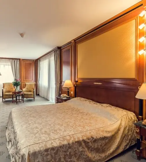
Оздоровительный комплекс «Ватутинки» принимая гостей вот уже 45 лет, предоставляет не только высококлассный сервис, но и массу дополнительных возможностей: активный отдых, оздоровление и релаксацию, хорошее настроение и неповторимый комфорт.
Мы надеемся, что побывав у нас однажды, вы по достоинству оцените качество оказанных услуг, и посетите наш комплекс снова! Ведь именно новая встреча с гостями является для нас наивысшей наградой и признанием!
С энтузиазмом и любовью к своему делу, мы создаём атмосферу тепла и комфорта, которую неизменно сможете ощутить вы и ваши близкие.
Добро пожаловать в оздоровительный комплекс «Ватутинки»!